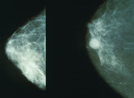
Left: a benign mammogram, right: a mammogram showing a cancerous tumour. Source: National Cancer Institute
You may have read about the recent Google Health study where the researchers trained and evaluated an AI model to detect breast cancer in mammograms.
It was reported in the media that the Google team’s model was more accurate than a single radiologist at recognising tumours in mammograms, although admittedly inferior to a team of two radiologists.
But what does ‘more accurate’ mean here? And how can scientists report it for a lay audience?
Imagine that we have a model to categorise images into two groups: malignant and benign. Imagine that your model categorises everything as benign, whereas in reality 10% of images are malignant and 90% are benign. This model would be useless but would also be 90% accurate.
This is a simple example of why accuracy can often be misleading.
In fact it is more helpful in a case like this to report two numbers: how many malignant images were misclassified as benign (false negatives), and how many benign images were misclassified as malignant (false positives).
The Google team reported both error rates in their paper:
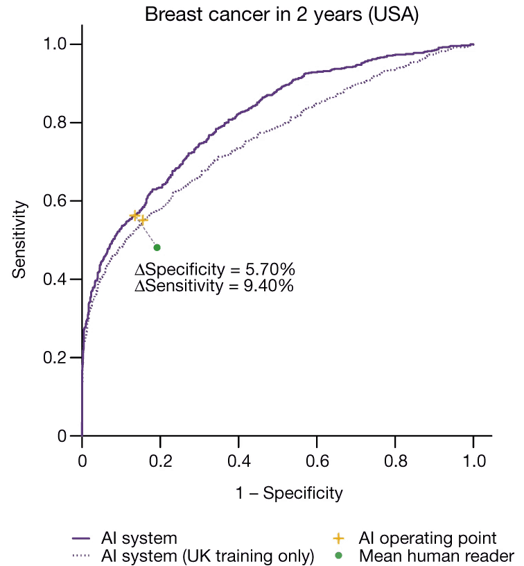
We show an absolute reduction of 5.7%… in false positives and 9.4%… in false negatives [compared to human radiologists].
McKinney et al, International evaluation of an AI system for breast cancer screening, Nature (2020)
This means that the model improved in both kinds of misclassifications. If only one error rate had improved with respect to the human experts, it would not be possible to state whether the new AI was better or worse than humans.
Sometimes we want even finer control over how our model performs. The mammogram model has two kinds of misdiagnoses: the false positive and the false negative. But they are not equal. Although neither kind of error is desirable, the consequences of missing a tumour are greater than the consequences of a false alarm.
For this reason we may want to calibrate the sensitivity of a model. Often the final stage of a machine learning model involves outputting a score: a probability of a tumour being present.
Fast Data Science - London
But ultimately we must decide which action to take: to refer the patient for a biopsy, or to discharge them. Should we act if our model’s score is greater than 50%? Or 80%? Or 30%?
If we set our cutoff to 50%, we are assigning equal weight to both actions.
However we probably want to set the cutoff to a lower value, perhaps 25%, meaning that we err on the side of caution because we don’t mind reporting some benign images as malignant, but we really want to avoid classifying malignant images as benign.
However we can’t set the cutoff to 0% - that would mean that our model would classify all images as malignant, which is useless!
So in practice we can vary the cutoff and set it to something that suits our needs.
Choosing the best cutoff is now a tricky balancing act.
If we want to evaluate how good our model is, regardless of its cutoff value, there is a neat trick we can try: we can set the cutoff to 0%, 1%, 2%, all the way up to 100%. At each cutoff value we check how many malignant→benign and benign→malignant errors we had.
Then we can plot the changing error rates as a graph.
We call this a ROC curve (ROC stands for Receiver Operating Characteristic).

This is the ROC curve of the Google mammogram model. The y axis is true positive rate, and the x axis is false positive rate. Source: McKinney et al (2020)
The nice thing about a ROC curve is that is lets you see how a model performs at a glance. If your model is just a coin toss, your ROC curve would be a straight diagonal line from the bottom left to the top right. The fact that Google’s ROC curve bends up and left shows that it’s better than a coin toss.
If we need a single number to summarise how good a model is, we can take the area under the ROC curve. This is called AUC (area under the curve) and it works a lot better than accuracy for comparing different models. A model with a high AUC is better than one with a low AUC. This means that ROC curves are very useful for comparing different AI models.
You can also put human readers on a ROC curve. So Google’s ROC curve contains a green data point for the human radiologists who were interpreting the mammograms. The fact that the green point is closer to the diagonal than any point on the ROC curve confirms that the machine learning model was indeed better than the average human reader.
Whether the machine learning model outperformed the best human radiologists is obviously a different question.
In healthcare, as opposed to other areas of machine learning, the cost of a false negative or false positive can be huge. For this reason we have to evaluate models carefully and we must be very conservative when choosing the cutoff of a machine learning classifier like the mammogram classifier.
It is also important for a person not involved in the development of the model to evaluate and test the model very critically.
If the mammogram was to be introduced into general practice in healthcare I would expect to see the following robust checks to prove its suitability:
If you think I have missed anything please let me know. I think we are close to seeing these models in action in our hospitals but there are still lots of unknown steps before the AI revolution conquers healthcare.
Thanks to Ram Rajamaran for some interesting discussions about this problem!
Hamzelou, AI system is better than human doctors at predicting breast cancer, New Scientist (2020).
McKinney et al, International evaluation of an AI system for breast cancer screening, Nature (2020).
Dive into the world of Natural Language Processing! Explore cutting-edge NLP roles that match your skills and passions.
Explore NLP Jobs
Unlock your business potential with expert AI consulting services from Fast Data Science. Discover strategies to accelerate growth and outperform competitors.

Financial advisors, like lawyers, are regulated in the UK. All financial advisors should be registered with the Financial Conduct Authority (FCA) and must have certain qualifications and have signed up to a code of ethics. UK financial advisors must also complete professional training every year.
What we can do for you